
Date: May 9, 2026

 COLOR PSYCHOLOGY IN DESIGNING CONSUMER DECISIONS
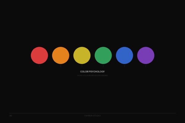
 Why do hospital waiting rooms use soft green? Why do fast food restaurants use red and yellow? Why do banks choose blue? The answer lies in Color Psychology — the study of how different colors affect human feelings, emotions, and behavior.
Colors send signals to the brain and trigger emotional responses almost instantly, which is why marketers and designers use them strategically to influence consumer decisions.
Red stimulates heart rate and creates urgency — why SALE signs are almost always red. McDonald’s, KFC, and Pizza Hut use red because it triggers hunger and speeds up decisions. Use when: driving urgent action, promotions, energy products.
Blue creates feelings of reliability and stability. Facebook, Samsung, PayPal, Visa, and Ford all use blue. Use when: banking, insurance, technology, healthcare, B2B.
Green is associated with nature, freshness, and money. Whole Foods, Starbucks, and most organic brands use it. Use when: organic products, health, sustainability, finance.
Yellow catches the eye fastest but causes fatigue quickest. IKEA uses yellow to communicate fun and accessibility.
Orange is approachable and friendly. Amazon uses orange on CTA buttons because it drives purchases effectively.
Historically the color of royalty, purple signals luxury and exclusivity. Cadbury and Hallmark use purple for this reason.
Chanel, Gucci, Nike, Apple — iconic brands use black to communicate premium quality and timelessness.
Choosing brand colors should never be just about personal preference. It requires understanding psychology, audience context, and competitive differentiation. The right colors can increase conversion rate, build brand recall, and create lasting emotional connections. Contact Fahrun Studio for expert help with your color palette.