
Date: May 9, 2026

 BOOSTING CREATIVITY WEBDESIGN & USABILITY
 Font pairing — the art of combining typefaces to create visual harmony and hierarchy — is both a science and a creative skill. Get it right and your design feels polished. Get it wrong and even great content looks amateurish.
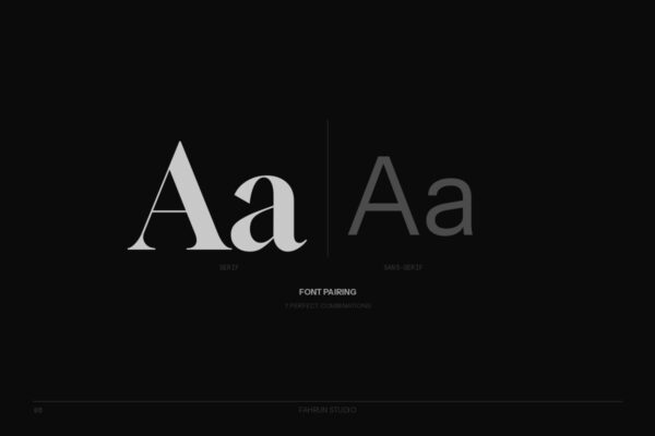
Font pairing is selecting two typefaces that complement each other. One serves as the display font (headlines, titles) and the other as the body font (paragraphs, supporting text). The goal is contrast with harmony.
Pair fonts that are different in style (e.g., serif with sans-serif) but share a similar overall feeling.
The display font should be visually dominant. The body font should be neutral enough not to compete.
Serif fonts feel traditional and authoritative. Sans-serifs feel modern and approachable. Match the personality to your brand.
Editorial, luxury, magazine. A classic of modern editorial design.
Professional, blog, corporate. Reliable for content websites.
Elegant, portfolio, creative agency. Refined aesthetic for design portfolios.
Bold, sports, news. High-impact headlines with easy-to-read body copy.
Luxury, high fashion, fine dining. For the most premium brand identities.
Modern Thai brand, tech, startup. One of the most versatile Thai font pairings.
Technical, editorial, documentation. Sibling pairing from Adobe, designed to work together.
A great font combination elevates an ordinary layout to something that feels premium. Study why each pairing works and develop your own instinct for combining typefaces.