
Date: May 9, 2026

 WEBDESIGN & USABILITY
 Typography is the backbone of web design. It affects not only how your site looks, but how users read, comprehend, and feel about your content. More importantly, it has a direct impact on your search engine rankings — Google measures page experience, and poor typography leads to higher bounce rates and lower dwell time.
Google does not just crawl your text — it measures how users interact with it. If visitors land on your page and leave because the text is too small or too dense, that negative signal feeds into your rankings. Good typography keeps people reading longer.
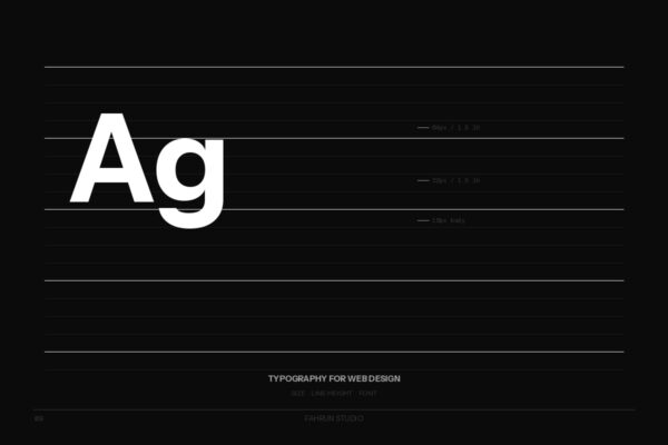
Modern web design standards recommend a base body font size of 16px to 18px for desktop. A practical type scale: Body 16–18px, H3 20–22px, H2 24–28px, H1 36–48px.
For body text, a line height of 1.5 to 1.7 is the sweet spot. Headings work well with 1.1 to 1.3. Use unitless multipliers, never fixed pixels.
The optimal line length is 60 to 75 characters per line (~600–700px at 18px). Use max-width: 70ch; in CSS.
font-display: swapWeb typography is a usability, accessibility, and SEO decision. Getting font size, line height, and loading strategy right will improve user experience and signal value to Google.