
Date: May 9, 2026

 COLOR PSYCHOLOGY IN DESIGNING WEBDESIGN & USABILITY
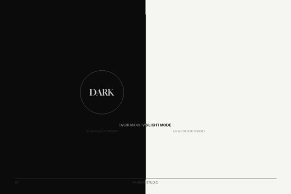
 Dark mode has gone from developer preference to a mainstream design feature. Choosing between them involves color theory, accessibility standards, user psychology, and measurable UX outcomes.
Light mode: dark text on light background — the traditional setting. Dark mode: light text on dark background — entered mainstream with Apple’s macOS Mojave in 2018.
In light mode, the pupil constricts, increasing depth of focus and making small text easier to read. In dark mode, the pupil dilates. This can cause text to “bloom” if contrast is too extreme, but reduces eye strain in low-light environments.
Pure black (#000000) causes eye fatigue. Google Material Design recommends #121212. Apple uses approximately #1C1C1E.
Desaturate accent colors by 10–20% in dark mode to maintain visual harmony.
In dark mode, surfaces closer to the user should be lighter than the base background.
WCAG 2.1 requires at least 4.5:1 for normal text. This applies equally to dark mode.
On OLED screens, true black pixels are switched off. Dark mode with black backgrounds can reduce battery by 40–60% vs pure white.
prefers-color-scheme media queryThe dark mode vs. light mode decision is contextual. Master the principles in this guide and you will design interfaces that are comfortable and accessible for every user.