
FAHRUN Studio Brand Agency

Logo
Shape Objective

Singha Planet isn't just a place; it's a testament to Singha's commitment to a sustainable and innovative future. In collaboration with the visionary team at Fahrun Studio and Muse, we embarked on a creative journey to design and develop an ecosystem that seamlessly blends technology, nature, and storytelling.

โลโก้ Singha Planet ออกแบบโดย FAHRUN Studio
shape A Harmonious Fusion

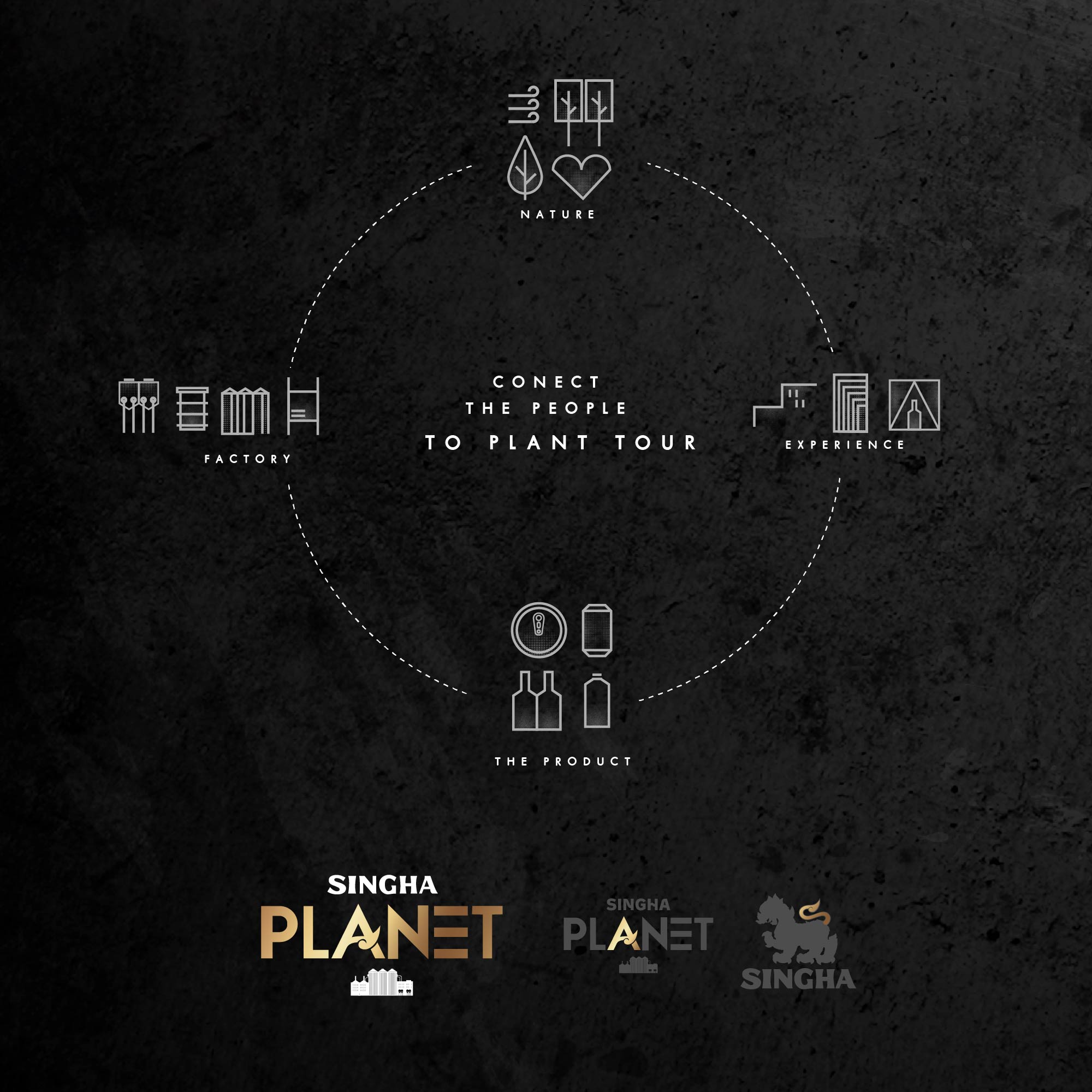
Our challenge was to translate Singha's core values into a tangible and engaging experience. We envisioned a space where the industrial, represented by the factory icons, met the organic, embodied by the leaves and heart shapes, within a circular economy. The interconnectedness of water, nature, people, product, and factory formed the basis of our design philosophy.

  • I. Logo. Design
  • II. Re Design Packaging
  • III. Brand Design System
  • IV. Website Design
โลโก้ Singha Planet ออกแบบโดย FAHRUN Studio
shape Design Language

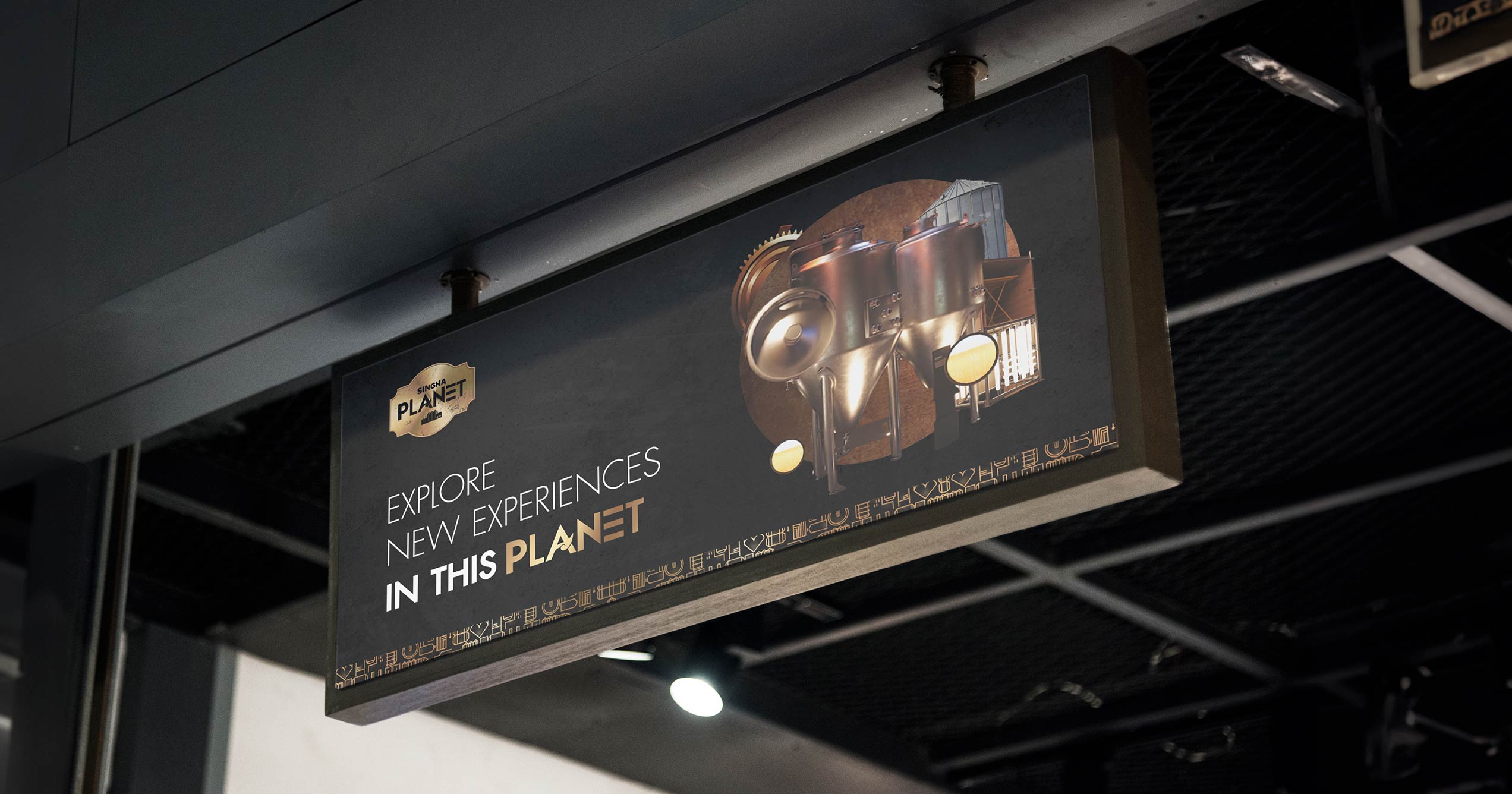
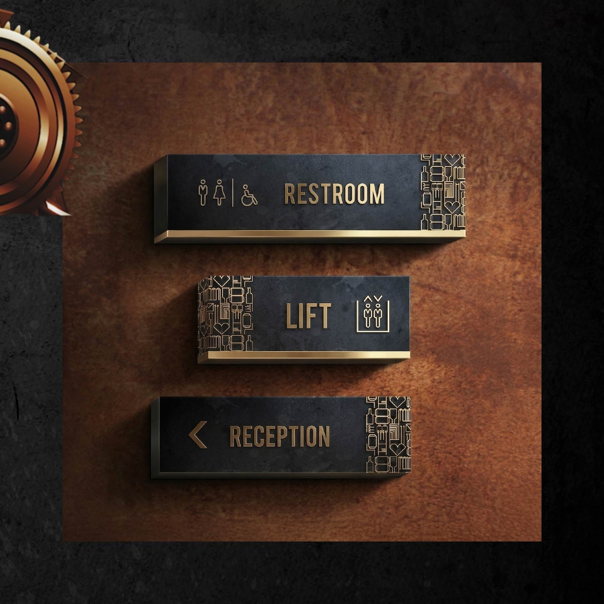
The visual language of Singha Planet is one of modern minimalism and intuitive navigation. Bold typography, stylized icons, and a rich color palette create a cohesive and memorable identity. From the striking facade to the detailed signage, every element was meticulously crafted to ensure a seamless and immersive brand experience.

Our process ensures that every visual and verbal element—from logos and color schemes to messaging and brand voice—aligns with your strategic goals, creating a unified and compelling brand presence. This alignment not only enhances recognition and fosters customer loyalty but also positions your brand as a leader in your industry.

With our tailored solutions, you gain clarity and consistency in your brand communication, ultimately leading to increased visibility, stronger market positioning, and sustainable growth.
Case Study

Challenge

Singha Planet set out to make Singha’s commitment to sustainability and innovation tangible. The project brought FAHRUN Studio and Muse together around a question of representation. How could a visitor see the connection between a factory, the natural resources it depends on, the products it makes, and the people involved? The identity had to tell that story in a physical space as well as on packaging and a website.

Approach

The design used the circular economy as its organizing idea. Factory icons represented industry, while leaves and heart shapes introduced nature and people into the same visual language. Water, products, and production were understood as connected parts of that system. A restrained composition gave the symbols room to read, while bold type and a rich palette gave the identity a distinctive presence. The same vocabulary could guide someone looking at the facade or reading a sign and remain recognizable when applied to a package or screen.

Deliverables

  • A logo and a visual identity system for Singha Planet.
  • A packaging redesign based on the project’s design language.
  • A website design extending the identity into a digital setting.

Outcome

Singha Planet gained a coherent visual identity across its physical and digital presence. The relationship between industry and nature became visible through recurring symbols, and the consistent treatment of type, color, and signs supported navigation through the space.

Client / Project type: Singha / Brand identity, packaging redesign, and website design

Let’s Connect

* Whether you have a question, or want to discuss a potential project, our team at
FAHRUN Studio is here to help. Please fill out the form below!!!

[contact-form-7 id="bfe4ea7" title="Contact"]
img
  • Depa
  • OMRON
  • Thai PBS
  • WInnonie
  • CPF
  • Manora
  • BEC Music
  • Promise
  • LG
  • Amarin
  • IRC
  • Bangjak
  • Babarah
  • 1577
  • Aime
  • FWd

Singha Planet

ENTH