
 PART OF DESIGN
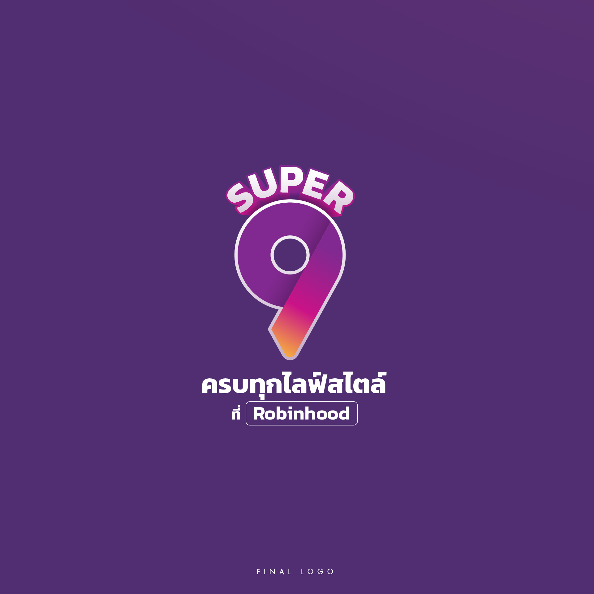
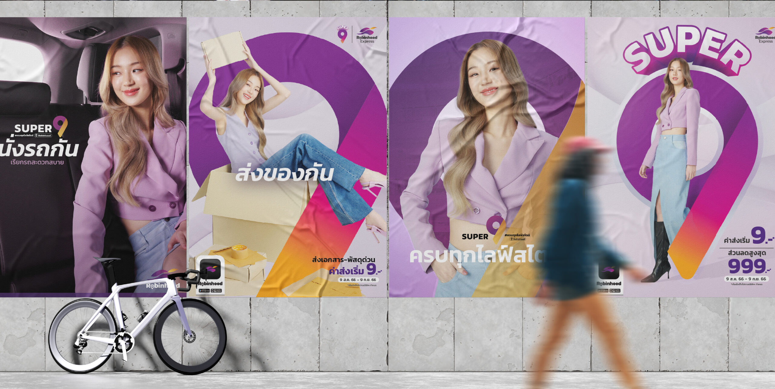
 We meticulously crafted a distinctive "Super 9" logo that instantly conveyed both the numerical value of the promotion and a sense of dynamic energy. The design integrated elements reflecting speed and special deals, ensuring it was recognizable and memorable across all digital touchpoints.
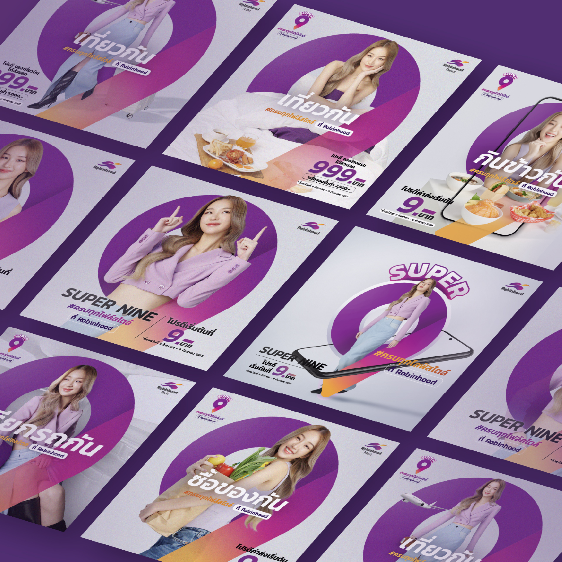
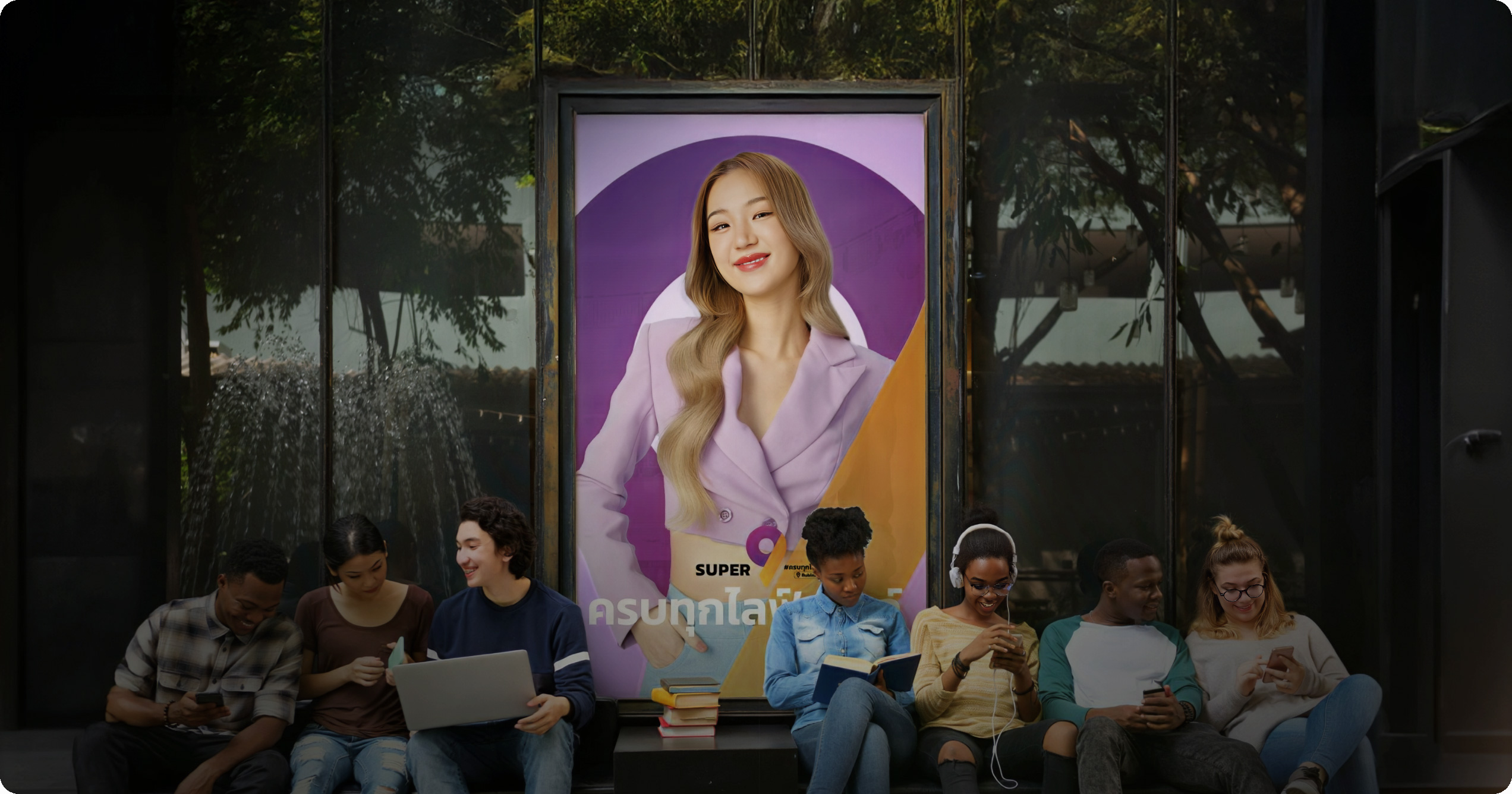
The Key Visual was designed to communicate the core message of "Super 9" – exceptional value and exciting opportunities – at a glance, drawing users further into the campaign. It established the overall look and feel that permeated all subsequent campaign materials.
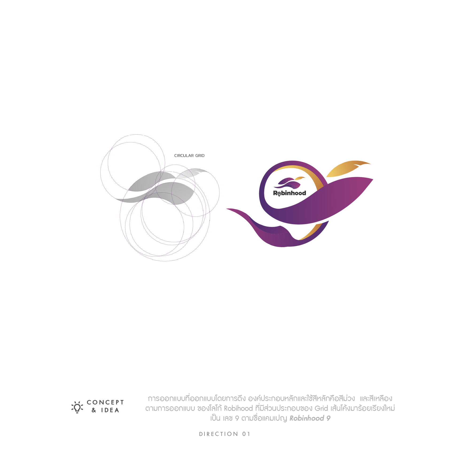
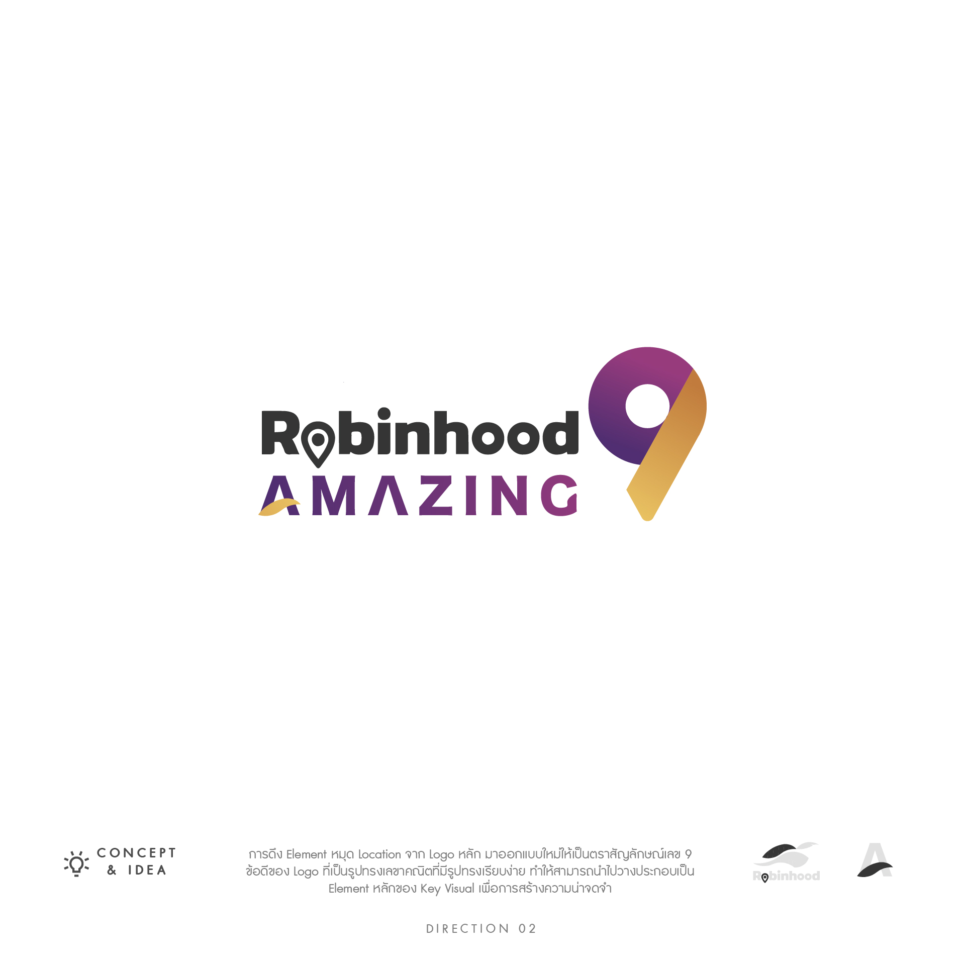
- I. Logo Design
- II. Key Visual Design
- III. Creative & Ideas
- IV. Graphic Design Materials
 SERVICE BENEFITS
 FAHRUN Studio approached the Robinhood Super 9 campaign with a focus on impact, clarity, and user engagement. We ensured that every design element, from the bold typography to the vibrant color palette, worked synergistically to convey urgency and excitement while clearly highlighting the campaign's value proposition. Our expertise in blending strategic thinking with compelling visuals allowed us to deliver a campaign that not only looked outstanding but also effectively drove user interaction and achieved Robinhood's marketing objectives.
This project is a testament to FAHRUN Studio's ability to translate marketing goals into visually stunning and highly effective digital experiences.